This is just a small piece of a hopefully bigger article analyzing what I've been looking at in the Review Signal data.
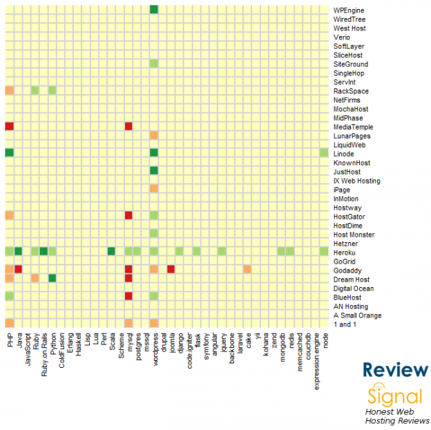
X-Axis: Programming Languages, Frameworks, Databases
Y-Axis: Web Hosting Company
Colors: The deeper the green, the more positive. The deeper the red, the more negative.
What stories do you see?
 WordPress & WooCommerce Hosting Performance Benchmarks 2021
 WooCommerce Hosting Performance Benchmarks 2020
 WordPress Hosting Performance Benchmarks (2020)
 The Case for Regulatory Capture at ICANN
 WordPress Hosting – Does Price Give Better Performance?
 Hostinger Review – 0 Stars for Lack of Ethics
 The Sinking of Site5 – Tracking EIG Brands Post Acquisition
 Dirty, Slimy, Shady Secrets of the Web Hosting Review (Under)World – Episode 1
 Free Web Hosting Offers for Startups