Every year I publish WordPress Hosting Performance Benchmarks. But after publishing, I rarely get a chance to spend time really digging into the data. I've begun testing for 2019 WordPress Hosting Performance Benchmarks but before I finish them, I wanted to at least publish some analysis from 2018 that explores a fundamentally interesting question:
Does Price Give Better Performance?
The load testing results show that the more expensive WordPress hosting plans can handle a lot of traffic. But load testing isn't the only metric measured during the tests; what about the other performance related measurements - how do they correlate with price?
A few notes to help understand the pricing structures. There are six price tiers I use for WordPress Hosting Performance Benchmarks: <25, 25-50, 51-100, 101-200, 201-500 and Enterprise (500+). This means all the plans in the price bracket cost somewhere in the specified range on monthly basis (in US dollars).
Contents
Uptime
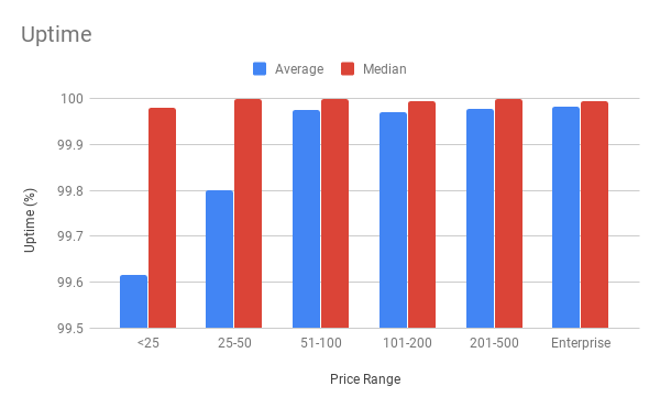
The uptime average and median percentages organized by price range. All raw data is available in the original blog posts. Since it's a bit hard to see I'll include the table used to generate this chart as well here:
| Price Tier ($/month) | Average Uptime | Median Uptime |
| <25 | 99.61566667 | 99.98 |
| 25-50 | 99.79958333 | 100 |
| 51-100 | 99.97666667 | 100 |
| 101-200 | 99.97 | 99.995 |
| 201-500 | 99.977 | 100 |
| Enterprise | 99.981875 | 99.995 |
What we can see is on average, there is a correlation between price and uptime. The median shows us that most hosts are capable of keeping servers online, but as you pay more, there are fewer issues too. Enterprise on average had a 99.98% uptime! That's ~8 minutes of downtime per month average or if we use the median number of 99.995% then it's ~2 minutes of downtime per month.
For perspective, the <25 average of 99.61566667% is roughly 2 hours and 48 minutes of downtime per month average, with the median being almost 9 minutes of downtime per month.
So in general, most companies stay online pretty well, but there also appears to be a positive correlation between price and uptime.
WPPerformanceTester PHP Bench Score
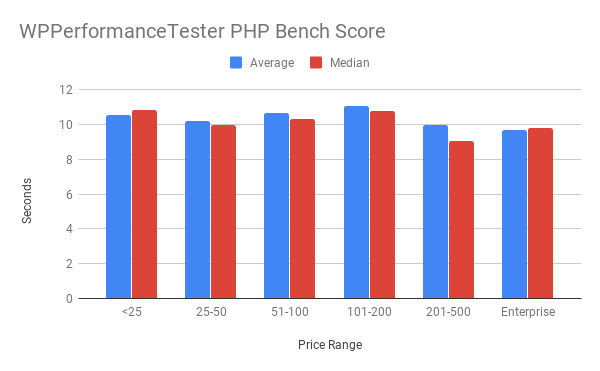
Lower scores mean faster server performance.
PHP Bench from my plugin WPPerformanceTester measures how quickly the server can do certain mathematical and string functions. This is designed to test the CPU on the server. More powerful CPUs should do this test faster. Mind you this is single threaded, so if your host has an architecture using a cluster of servers to handle requests, this isn't an apples to apples comparison at all.
If we look at the results there appears to be a weakly positive correlation between price and performance. 201-500 and Enterprise have the lowest average and medians. There is a lot of variance here though with 101-200 looking like the worst alongside <25. It could be a sample size issue where that price range only had 5 plans. CPU speed isn't perhaps the best measure of performance when looking holistically at WordPress performance, but it could be a tiny part depending on what you're application does.
WPPerformanceTester WP Bench Score
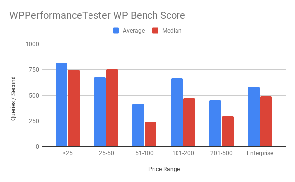
Higher scores mean faster execution of WordPress database queries
WP Bench Score is from the same plugin, WPPerformanceTester, and it measures how quickly the server can do certain WordPress functions (insert, select, update, delete) through $wpdb. This tests how quick the database queries are, using WordPress. This gets complicated because throughput can look very different on different architectures. When the database runs on the same machine as the web server, there's virtually no latency and the scores tend to look substantially higher. On more complex and high availability setups with separate or multiple database servers, these scores tend to look lower.
If we look at the general correlation there appears to be an almost parabolic shape to the graph. The cheapest plans have the highest scores because most tend to run everything on the same host. The sample sizes start to shrink in the mid ranges, so I'm not sure how representative they are, but they make a performance comeback at the Enterprise level. Not as high, but higher than some of the middle tier. This could indicate better and/or faster servers but in a distributed environment. It's hard to draw any meaningful conclusions off this test because of the way it works. But if I had to say something it seems like you get better performance that's probably scaled out more as costs increase. Performance on this test also varies incredibly wildly. In the <25/month price range we had 181 to 1477 as the range of results.
Web Page Testing Results
Lower scores mean faster delivery of the web site to the testing location.
One important thing to note about comparing between price ranges is that I performed these tests grouped within price ranges. So the <25 tests should have all been done around the same time and Enterprise tests would be done at the same time. But that doesn't mean <25 and Enterprise tests were done at the same time. They were only performed once (with 9 iterations on the test), but sometimes testing locations could be having issues, certain regions could be experiencing issues, it makes cross-comparing more difficult because the network conditions could vary more. If this were to be repeated and given a stricter testing methodology, multiple samples would be taken at as close to the same time as possible to make comparisons more valid. Most servers were also hosted in the US, but some were not, which would affect results especially in certain regions potentially.
There does appear to be a loose correlation that the more expensive plans, on average, respond quicker around the globe. In the US, where most servers are located, that advantage seems a lot less pronounced. Some providers also seemed to perform out of the box better in general. At the Enterprise level, WordPress.com VIP consistently was the fastest winning the fastest speed in 9/11 different locations and coming in second by 22ms and 9ms respectively in the other two locations to Pantheon (who came in second fastest 7 times).
Conclusion
In general, there does appear to be a positive correlation between how much you pay and how much performance you get. This is somewhat reassuring that more expensive plans are actually adding value beyond simply serving more users. It's not a rule at the specific host level and there are definitely some companies performing better than others. It raises further questions, are there a lot of less performant hosts in the lower tier that bring the averages down? Is there some sampling bias that compels more expensive companies that are competing for higher priced customers to only put their best foot forward? There are a lot fewer plans in the middle tiers with an uptick at the enterprise price tier. It's hard to give a definitive answer, but as a whole, price seems to correlate with performance in WordPress hosting.
Bonus Charts #1 (Web Page Test Response Times by Year)
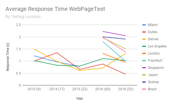
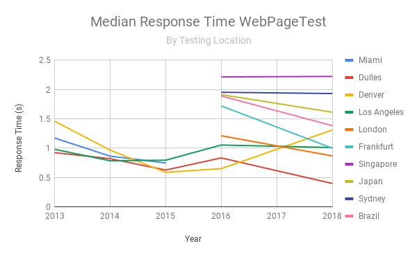
It's really interesting to see that over time, on average, response times have gone down over the years from almost every location (what's up with you Denver?). The parenthetical numbers by year are how many companies participated that year.
Bonus Charts #2 (Web Page Test by Price Tier)
Image credit: chart by Oeda from the Noun Project.
Kevin Ohashi
Latest posts by Kevin Ohashi (see all)
- Analyzing Digital Ocean’s First Major Move with Cloudways - February 28, 2023
- Removing old companies - June 28, 2021
- WordPress & WooCommerce Hosting Performance Benchmarks 2021 - May 27, 2021
 WordPress & WooCommerce Hosting Performance Benchmarks 2021
 WooCommerce Hosting Performance Benchmarks 2020
 WordPress Hosting Performance Benchmarks (2020)
 The Case for Regulatory Capture at ICANN
 WordPress Hosting – Does Price Give Better Performance?
 Hostinger Review – 0 Stars for Lack of Ethics
 The Sinking of Site5 – Tracking EIG Brands Post Acquisition
 Dirty, Slimy, Shady Secrets of the Web Hosting Review (Under)World – Episode 1
 Free Web Hosting Offers for Startups