

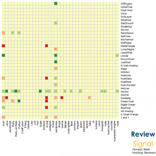
This is just a small piece of a hopefully bigger article analyzing what I've been looking at in the Review Signal data.
X-Axis: Programming Languages, Frameworks, Databases
Y-Axis: Web Hosting Company
Colors: The deeper the green, the more positive. The deeper the red, the more negative.
What stories do you see?
The following two tabs change content below.


Kevin Ohashi
Founder at Review Signal
Kevin Ohashi is the geek-in-charge at Review Signal. He is passionate about making data meaningful for consumers. Kevin is based in Washington, DC.
Latest posts by Kevin Ohashi (see all)
- Analyzing Digital Ocean’s First Major Move with Cloudways - February 28, 2023
- Removing old companies - June 28, 2021
- WordPress & WooCommerce Hosting Performance Benchmarks 2021 - May 27, 2021
 WordPress & WooCommerce Hosting Performance Benchmarks 2021
 WooCommerce Hosting Performance Benchmarks 2020
 WordPress Hosting Performance Benchmarks (2020)
 The Case for Regulatory Capture at ICANN
 WordPress Hosting – Does Price Give Better Performance?
 Hostinger Review – 0 Stars for Lack of Ethics
 The Sinking of Site5 – Tracking EIG Brands Post Acquisition
 Dirty, Slimy, Shady Secrets of the Web Hosting Review (Under)World – Episode 1
 Free Web Hosting Offers for Startups

where’s the key? I dont know what the colors mean.
“Colors: The deeper the green, the more positive. The deeper the red, the more negative.”
So basically, if you want anything, use Heroku
They seem to have the widest array of developers talking about their services, positively.
Bit confused by this graphic Kevin. 🙂
yeah, it’s not quite the visualization I hoped for. I thought it was interesting and this was the best way I could get it to display, but I’m still not happy with it. The goal was to show which tech stuff is talked about with regards to which web hosts. Hoping it would highlight strengths and focuses (and maybe weaknesses)